ARCHIVES ▾
CBA ▾
CALCS ▾
OUTILS - FANTASY HOCKEY ▾
OUTILS ▾
JOUEURS ▾
ÉQUIPES ▾
CONFÉRENCE DE L'OUEST
PACIFIQUE
CONFÉRENCE DE L'EST
MÉTROPOLITAINE
RECHERCHER

 Their new logo is better than their old one, but I don't love it.
 Their new logo is better than their old one, but I don't love it. Their new logo is better than their old one, but I don't love it.
 Day 14 of no hockey... flushed the toilet just to see the Canadiens logo... pic.twitter.com/Qng4uQPzdh
— Chris Kuzyk (@_KOOZ_) March 25, 2020
Their new logo is better than their old one, but I don't love it. 
Ready for Red Deer! 2️⃣3️⃣ players will wear the 🍁 with 🇨🇦’s National Men’s Summer Under-18 Team at the 2022 #HlinkaGretzkyCup.ROSTER ➡️ https://t.co/fuxzWvzOWb pic.twitter.com/EKmz4rmeRt
— Hockey Canada (@HockeyCanada) July 25, 2022
Ready for Red Deer! 2️⃣3️⃣ players will wear the 🍁 with 🇨🇦’s National Men’s Summer Under-18 Team at the 2022 #HlinkaGretzkyCup.ROSTER ➡️ https://t.co/fuxzWvzOWb pic.twitter.com/EKmz4rmeRt
— Hockey Canada (@HockeyCanada) July 25, 2022
Ready for Red Deer! 2️⃣3️⃣ players will wear the 🍁 with 🇨🇦’s National Men’s Summer Under-18 Team at the 2022 #HlinkaGretzkyCup.ROSTER ➡️ https://t.co/fuxzWvzOWb pic.twitter.com/EKmz4rmeRt
— Hockey Canada (@HockeyCanada) July 25, 2022
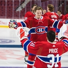
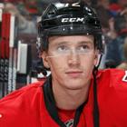
Welcome back, Zinger!The #Canes have inked Ryan Dzingel to a one-year, two-way contract.Details » https://t.co/O3ux4U7htK pic.twitter.com/wslXAEoDnM
— Carolina Hurricanes (@Canes) July 25, 2022
Welcome back, Zinger!The #Canes have inked Ryan Dzingel to a one-year, two-way contract.Details » https://t.co/O3ux4U7htK pic.twitter.com/wslXAEoDnM
— Carolina Hurricanes (@Canes) July 25, 2022


 CapFriendly
 CapFriendly