Emotionally in 2018
Rejoint: nov. 2016
Messages: 9,290
Mentions "j'aime": 3,387
ANA - logo and font are kinda weird, but I like the color scheme of it. Not particularly good, but not quite as bad as most think it is. Definitely would've wanted something with the OG Mighty Duck logo
ARI - the purple is beautiful and using the peyote logo was the right call. The desert scenery on the bottom is interesting, but I don't think it will take away from the beauty of the jersey
BOS - I've never been a fan of yellow, and this is a very boring yellow jersey. Not for me
BUF - the more I look at it the less I like it. The logo is cool, I just don't like the colors. I'm also not a huge fan of the royal and yellow combination in general, but I know I'm in the minority with that
CAL - a lot of people either love it or hate it, but I think it's just meh. I'm usually a big fan of black jerseys, but I can't say there's anything I really like or really dislike about it
CAR - love the Whalers logo, but I would've liked to see them do something to modernize it a bit more to not look like a normal retro jersey. Maybe use a green base and throw some red accents in there?
CHI - just looks like another Blackhawks alternate jersey. It looks good, just not nearly as imaginative or creative as a lot of the other ones
COL - absolute beauty. I wasn't even around for the Nordiques, so nostalgia doesn't play a factor here. The colors are perfect and it's a very clean look. The best of them all
CBJ - I'm in the minority with this one, but I love it. The red jersey with the white yoke is beautiful and the logo fits perfectly. They really nailed this one, especially considering how short they've been around
DAL - another one that I'm in the minority with, but I kinda like it. The main logo itself could use some more color, but I think it's a slick and clean jersey. The silver, green and black look nice on the white
DET - the jersey itself looks good, but it's just so boring. They should've done something with the DETROIT lettering that they used on one of their outdoor jerseys
EDM - it's a nice jersey, but just kinda goes with everything they have now. I would've liked to see some changing in the coloration of the logo, but not bad
FLA - I can't say I really have an opinion on this one. Just reminds me of the old Southeast Division days without anything that stands out with it
LAK - beautiful look, they absolutely nailed this one. I love purple and hate yellow, but the yellow provides a nice accent. They used the right logo as well
MIN - Subway jersey. I thought they missed a great opportunity to use the M logo that they have, like how the old North Stars used the N. I don't like this one
MTL - another beauty. They should've had this as an alternate jersey for years. The royal blue looks incredibly good
NAS - it's definitely better than what they wear right now. Still not a fan of yellow jerseys, but the grey shoulders and navy accents help a lot
NJD - this one is growing on me a lot. I love the white jerseys with the green accents, and the green base looks pretty good
NYI - there's no way Lou didn't design this one himself and think it's so creative and imaginative
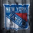
NYR - we all love Lady Liberty, but they still should've done something more unique with it than changing the forearm color. That doesn't change the fact that I want one
OTT - correct me if I'm wrong, but is this not just a red version of the jerseys they just released? This should be the alternate and the reverse retro should've used the O logo
PHI - just looks like their normal jerseys with a black yoke. Pretty meh to me, not a lot to talk about
PIT - I like the overall design of the jersey. Simple and clean. I don't really see the reverse aspect of it, but I like the jersey nonetheless
SJS - I'm usually not a dan of grey jerseys, but this one looks clean. The Sharks old looks are amazing, so they did a good job with this one
STL - this is pretty sweet. They look better in blue, but the red is bold and creative. I like it a lot
TBL - another one I like a lot. The white yoke looks awesome with the blue jersey and black accents
TOR - very boring and basic. I get that it's tough for the Original 6 teams to be super creative with their jersey designs, so props to them for trying I guess
VAN - the design of the jersey is sweet, but I think they should've gone with the box logo instead of the orca. Still a nice, bold jersey
VGK - it's amazing how a team that's been around for 3 years is is more creative than the teams that have been around for 70. These are slick, and the nod to the old IHL team is really cool
WAS - thank the lord almighty, I've wanted this jersey for years. I can't wait to get one, the Caps couldn't have had a better reverse retro jersey
WPG - the grey is kinda weird, but the logo and fonts are so nice. The blue accents are so nice, but the grey base makes it tough to love


 CapFriendly
 CapFriendly